A Times Magazine-ProPublica investigation reveals how the U.S. painstakingly built a case against a Mexican general suspected of links to organized crime — and then decided to let him go.
When it comes to knowing yourself, your own perception of your personality doesn’t necessarily align with that of people around you. But which is more accurate? And can discovering your true nature lead to a better life?
The International Liquid Mirror Telescope, perched high in the Himalayas, has finally started making observations. If it succeeds, we could one day put a much larger liquid telescope on the moon
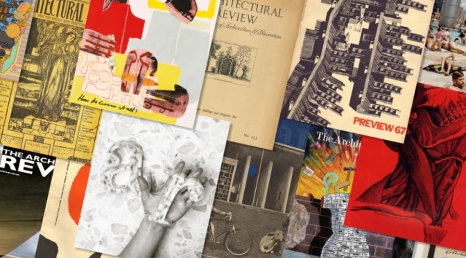
The Architectural Review December 2022 issue: Whether it’s a house, a room or a collection of objects, homes are the imprint of the people who inhabit them. Described as the ‘detritus of life’ by Sam Johnson-Schlee in this issue’s keynote, the remnants of our daily lives can say much about who we are, while the possessions we choose to display around us say more about how we want to be seen.
Charles Jencks and Maggie Keswick | Anupama Kundoo | Margarete Schütte-Lihotzky | João Batista Vilanova Artigas | Laurie Simmons | Kochi Architects Studio | Ekar Architects | Atelier Tho.A | Chat Architects | Fernanda Canales Arquitectura | Brillhart Architecture
Very few people have the resources to realise the house of their dreams, yet the results can be extraordinary. From the London home of Charles Jencks and Maggie Keswick, which is a manifestation of their postmodern fantasies, to the local materials and construction techniques of Anupama Kundoo’s Wall House in Auroville, this issue revisits houses designed by architects for themselves, and sometimes their families. Also celebrated are the winning projects of the 2022 AR House Awards, featuring innovative and intriguing dwellings from Mexico, Japan, Thailand, Vietnam and the Bahamas.
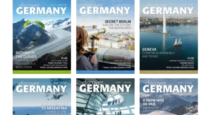
@GermanyMagazineDecember 2022 issue: White winter getaways, Germany’s apple cider route, the spa town of Bad Ragaz, a special focus on Christmas markets, an interview with actress Cristina do Rego, as well as a special look at interior design and architecture, the most innovative communication agencies, efficient digital solutions, top hotels across the DACH region, spa breaks and much more.
‘Tis the season to embrace cosiness and togetherness. And what better way to do that than to travel to hidden winter gems where visitors can leave their busy everyday lives behind? We picked three getaway ideas in Switzerland, Austria and Germany that embody white Christmas to the fullest and should be on everyone’s bucket list this winter.
While the Bavarians are chugging from their MassKrugs at Oktoberfest, and those along the Rheingau are celebrating the Feder Weisser festivals, the residents of Hessen are rejoicing in a different kind of harvest.
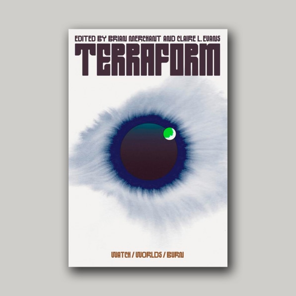
“This cover feels simultaneously classic and entirely new. It’s slightly reminiscent of 1970s science fiction covers (albeit much more restrained), and yet I’ve never seen anything quite like it. That custom type! That illustration! Is it a world? An eye? Something else? All of the above? As a reader, I don’t typically gravitate toward sci-fi, but this cover is so compelling that it made me immediately want to buy the book.”
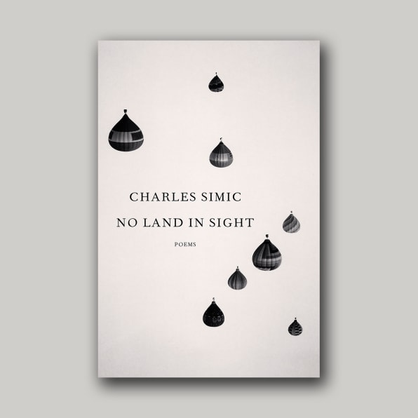
“There were so many eye-catching covers this year, but the one that constantly stood out for me because of its stunning simplicity, beauty and mystery was designed by John Gall: No Land in Sight. In a sea of gorgeous covers exploding with kaleidoscopic colorful backgrounds, with elements twisting and intertwining, with the title and author type set in sans-serif condensed fonts, Gall’s cover was refreshing for its clean layout, tasteful typography, elements that are balanced and non-overlapping, in an austere monochromatic palette. Timeless.”
[Cover Images: Picador]
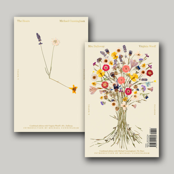
MRS. DALLOWAY & THE HOURS, DESIGNED BY PABLO DELCAN
“The whole package is stunning and smart—words I use a lot to describe Pablo Delcan’s works. The covers evoke introspectiveness and intimacy in such a beautiful way. Everything from the type to the flower placement feels considered and intentional. I love how both sides mirror and work with each other visually and conceptually.”
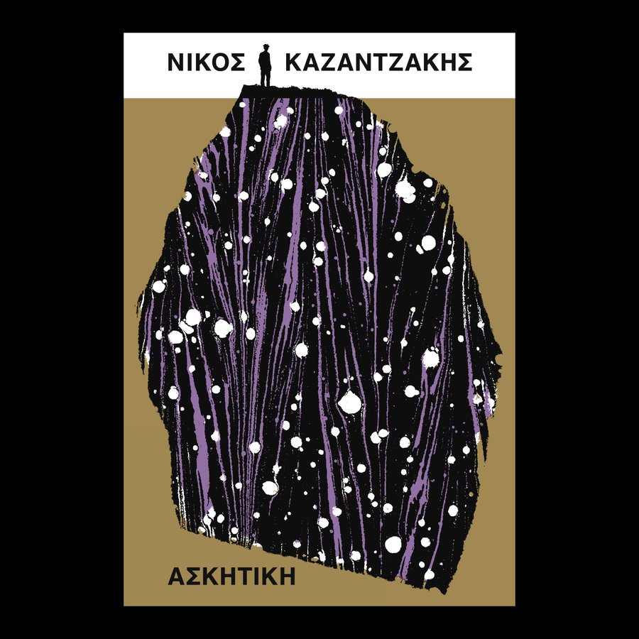
“This cover is a feast of dualities: both a figurative scene and an abstract texture; a figure seen far off in the distance and a marbled paper viewed at almost 1:1 in scale; a formal, rigid, block colored layout, and a big, expressive interruption in the middle. The slightly muted colors are so refreshing, especially in a year when we’re reaching peak ‘pop,’ and David shows us here that you don’t need neon Pantones or massive type to create a big, bold, absorbing cover. I love that the type is almost pushed to the peripheries by the sprawl of the illustration, as if it’s something that’s happened over centuries; it makes everything feel massive in scale. Also, the silhouette of the figure is from a photo of the author, which is a perfect Pearson point of detail! There are worlds existing in this book cover, and I find it very easy to get lost in them.”
News, Views and Reviews For The Intellectually Curious