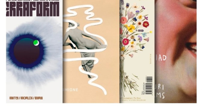
Fast Company Magazine (December 5, 2022) – The best book covers of 2022 as chosen by the best designers in publishing.
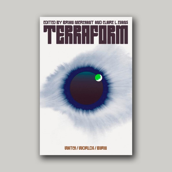
TERRAFORM, DESIGNED BY CHLOE SCHEFFE
Selected by Alicia Tatone
“This cover feels simultaneously classic and entirely new. It’s slightly reminiscent of 1970s science fiction covers (albeit much more restrained), and yet I’ve never seen anything quite like it. That custom type! That illustration! Is it a world? An eye? Something else? All of the above? As a reader, I don’t typically gravitate toward sci-fi, but this cover is so compelling that it made me immediately want to buy the book.”
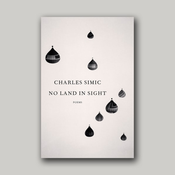
NO LAND IN SIGHT, DESIGNED BY JOHN GALL
Selected by Henry Sene Yee
“There were so many eye-catching covers this year, but the one that constantly stood out for me because of its stunning simplicity, beauty and mystery was designed by John Gall: No Land in Sight. In a sea of gorgeous covers exploding with kaleidoscopic colorful backgrounds, with elements twisting and intertwining, with the title and author type set in sans-serif condensed fonts, Gall’s cover was refreshing for its clean layout, tasteful typography, elements that are balanced and non-overlapping, in an austere monochromatic palette. Timeless.”
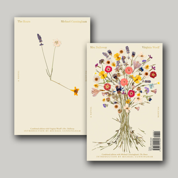
MRS. DALLOWAY & THE HOURS, DESIGNED BY PABLO DELCAN
Selected by Grace Han
“The whole package is stunning and smart—words I use a lot to describe Pablo Delcan’s works. The covers evoke introspectiveness and intimacy in such a beautiful way. Everything from the type to the flower placement feels considered and intentional. I love how both sides mirror and work with each other visually and conceptually.”
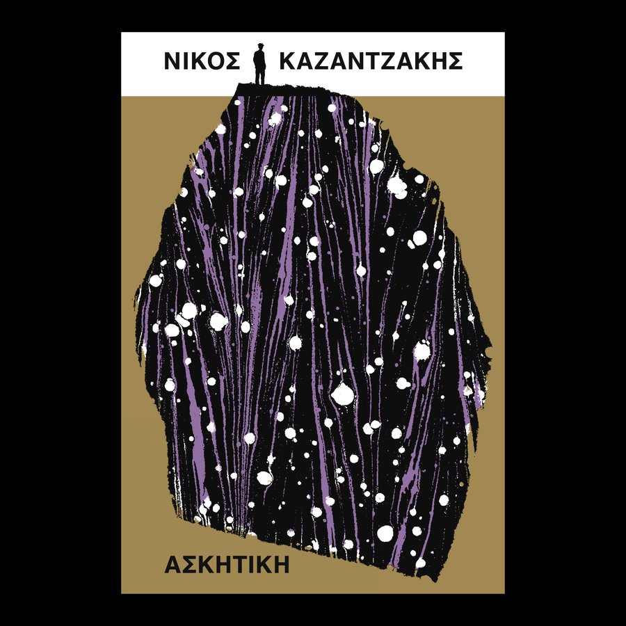
ASCESIS, DESIGNED BY DAVID PEARSON
Selected by Jack Smyth
“This cover is a feast of dualities: both a figurative scene and an abstract texture; a figure seen far off in the distance and a marbled paper viewed at almost 1:1 in scale; a formal, rigid, block colored layout, and a big, expressive interruption in the middle. The slightly muted colors are so refreshing, especially in a year when we’re reaching peak ‘pop,’ and David shows us here that you don’t need neon Pantones or massive type to create a big, bold, absorbing cover. I love that the type is almost pushed to the peripheries by the sprawl of the illustration, as if it’s something that’s happened over centuries; it makes everything feel massive in scale. Also, the silhouette of the figure is from a photo of the author, which is a perfect Pearson point of detail! There are worlds existing in this book cover, and I find it very easy to get lost in them.”

