Tag Archives: Book Covers

Art & Design Reviews: The Best Book Covers Of 2022

Fast Company Magazine (December 5, 2022) – The best book covers of 2022 as chosen by the best designers in publishing.

[Cover Image: MCD x FSG Originals]

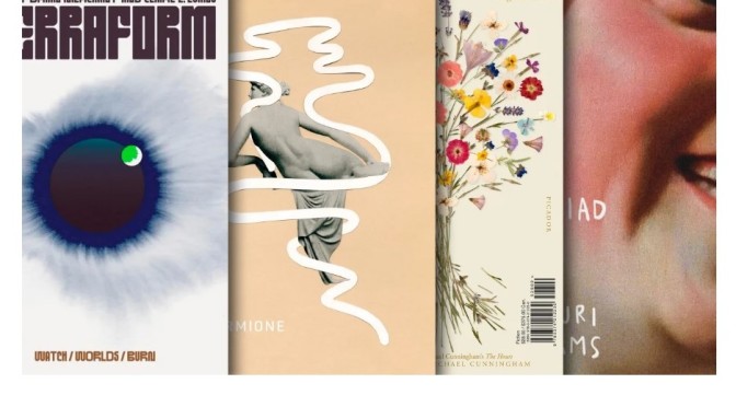
TERRAFORM, DESIGNED BY CHLOE SCHEFFE

Selected by Alicia Tatone

“This cover feels simultaneously classic and entirely new. It’s slightly reminiscent of 1970s science fiction covers (albeit much more restrained), and yet I’ve never seen anything quite like it. That custom type! That illustration! Is it a world? An eye? Something else? All of the above? As a reader, I don’t typically gravitate toward sci-fi, but this cover is so compelling that it made me immediately want to buy the book.”

[Cover Image: Knopf]

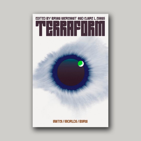
NO LAND IN SIGHT, DESIGNED BY JOHN GALL

Selected by Henry Sene Yee

“There were so many eye-catching covers this year, but the one that constantly stood out for me because of its stunning simplicity, beauty and mystery was designed by John Gall: No Land in Sight. In a sea of gorgeous covers exploding with kaleidoscopic colorful backgrounds, with elements twisting and intertwining, with the title and author type set in sans-serif condensed fonts, Gall’s cover was refreshing for its clean layout, tasteful typography, elements that are balanced and non-overlapping, in an austere monochromatic palette. Timeless.”

[Cover Images: Picador]

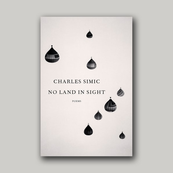
MRS. DALLOWAY & THE HOURS, DESIGNED BY PABLO DELCAN

Selected by Grace Han

“The whole package is stunning and smart—words I use a lot to describe Pablo Delcan’s works. The covers evoke introspectiveness and intimacy in such a beautiful way. Everything from the type to the flower placement feels considered and intentional. I love how both sides mirror and work with each other visually and conceptually.”

The best book covers of 2022

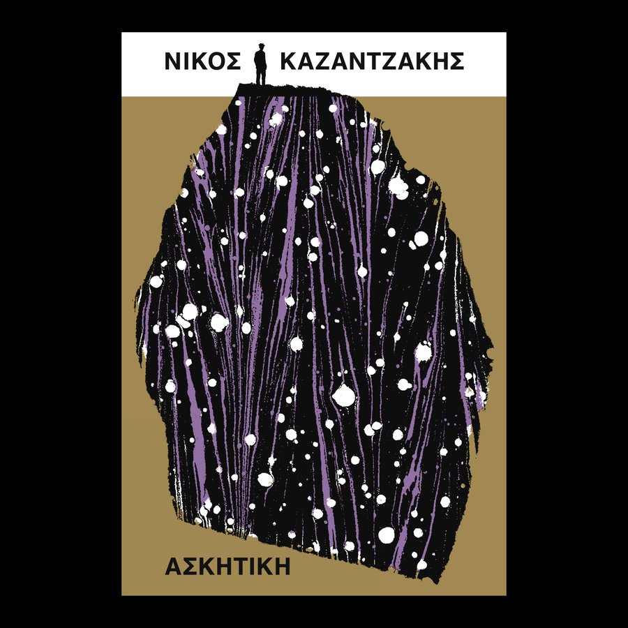
ASCESIS, DESIGNED BY DAVID PEARSON

Selected by Jack Smyth

“This cover is a feast of dualities: both a figurative scene and an abstract texture; a figure seen far off in the distance and a marbled paper viewed at almost 1:1 in scale; a formal, rigid, block colored layout, and a big, expressive interruption in the middle. The slightly muted colors are so refreshing, especially in a year when we’re reaching peak ‘pop,’ and David shows us here that you don’t need neon Pantones or massive type to create a big, bold, absorbing cover. I love that the type is almost pushed to the peripheries by the sprawl of the illustration, as if it’s something that’s happened over centuries; it makes everything feel massive in scale. Also, the silhouette of the figure is from a photo of the author, which is a perfect Pearson point of detail! There are worlds existing in this book cover, and I find it very easy to get lost in them.”

Views: ‘Richard Chopping: The Original Bond Artist’

In April 1956, at the suggestion of his friend Francis Bacon, Richard Chopping took the society hostess Ann Fleming to see some of his trompe l’oeil paintings, which were then on show at the Arthur Jeffress Gallery in Mayfair. Impressed by these pictures, Fleming invited the artist to meet her husband, Ian, who was looking for someone to provide dust-jacket illustrations for his James Bond novels.

Peter Parker
 31 AUGUST 2021

Chopping was immediately offered the job, and his striking designs remain the work for which he is best known and are, for many collectors, the reason the novels are particularly prized.

As this small but imaginatively curated exhibition demonstrates, there was a great deal more to Chopping than James Bond. Nevertheless, the highly detailed, finely executed and often macabre paintings he produced for Fleming are characteristic of his work as a whole. Born in Essex in 1917, Chopping moved to London at the age of 18 with little idea of what he wanted to do, but soon got a job on the magazine Decorations of the Modern Home.

Read more

1950’s Artwork: English Painter John Minton’s “Lavish” Food Book Covers

From Apollo Magazine article (April 13, 2020):

John Minton Illustration for French Cooking by Eizabeth David
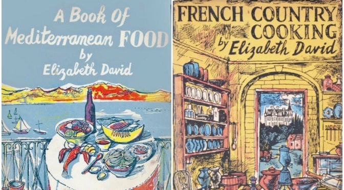
Minton had gone on to produce a series of spectacularly colourful oil paintings of Corsica on his return to London, exhibiting them at the Lefevre Gallery in 1949. Many of them depicted fruit and fish and other ingredients for Mediterranean cuisine, and so confirmed Minton as the obvious choice for the David commission. 

David delightedly recalled that: ‘In the shop windows [Minton’s] brilliant blue Mediterranean bay, his tables spread with white cloths and bright fruit, bowls of pasta and rice, a lobster, pitchers and jugs and bottles of wine, could be seen far down the street.’

Variations on these two images were used for the double-page spread on which the title appeared in David’s second book, French Country Cooking (1951), while the wrap-around image on the dust jacket depicted the interior of a well-stocked kitchen, many of its utensils borrowed from the author to ensure accurate representation.

Read full article

Francis John Minton (25 December 1917 – 20 January 1957) was an English painter, illustrator, stage designer and teacher. After studying in France, he became a teacher in London, and at the same time maintained a consistently large output of works. In addition to landscapes, portraits and other paintings, some of them on an unusually large scale, he built up a reputation as an illustrator of books.

In the mid-1950s, Minton found himself out of sympathy with the abstract trend that was then becoming fashionable, and felt increasingly sidelined. He suffered psychological problems, self-medicated with alcohol, and in 1957 died by suicide.

From Wikipedia

Art & Humor Spotlight: 56-Year Old British Painter Harland Miller’s “Iconic Penguin Book Covers”

From a Maddox Gallery website (March 20, 2020):

Harland-Miller-Ill-Never-Forget-What-I-Cant-Remember
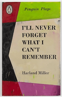
Miller’s Penguin book covers and ironic titles catch the art world’s eye

These covers are closer to still life studies, rather than two-dimensional posters. Experimenting with different paper sizes and angles, he occasionally shows their spines, and the shadows they cast. It is a celebration of books as treasured objects. His drawings – in particular his studies for his large-scale oil paintings with their notes scribbled down the margins – are some of his most intimate works to date.

The ensuing images are humorous, sardonic and nostalgic at the same time, while the painting style hints at the dog-eared, scuffed covers of the Penguin classics themselves.

Starting with Jay Jopling in 1996, when Miller exhibited in a group show at London’s Institute of Contemporary Art, his works have garnered many a famous fan. Amongst which are AC/DC’s guitarist Angus Young, David Bailey, and Elton John – whose work amusingly, if a little painfully, bears the title ‘International Lonely Guy.’

George Michael, with his Harland Miller piece ‘Incurable Romantic Seeks Dirty Filthy Whore‘ commanded  £237,500 in the posthumous auction of his art collection last year.

Read more

Pop Art Books: “Mirages – The Art Of Laurent Durieux” (March 2020)

Mirages The Art of Laurent Durieux
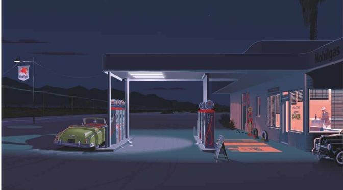
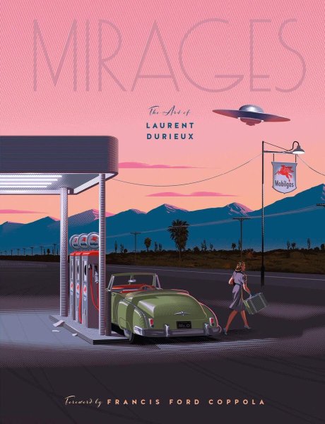
Laurent Durieux is a famous Belgian illustrator well known to lovers of pop culture and collectors for his reinterpretations of posters of cult films. Each of his American exhibitions was sold out during the opening night and in the presence of thousands of enthusiastic fans.

This book will be his first monograph and will cover his entire career, with a particular focus on his posters of the most emblematic alternative films (notably Jaws, The Birds, Vertigo and The Master). The book includes a 6-page section of art on rejected and unpublished posters and a preface by filmmaker and collector Durieux Francis Ford Coppola.

To review or purchase